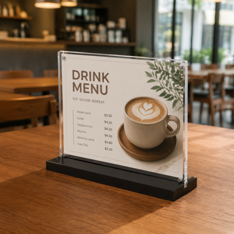
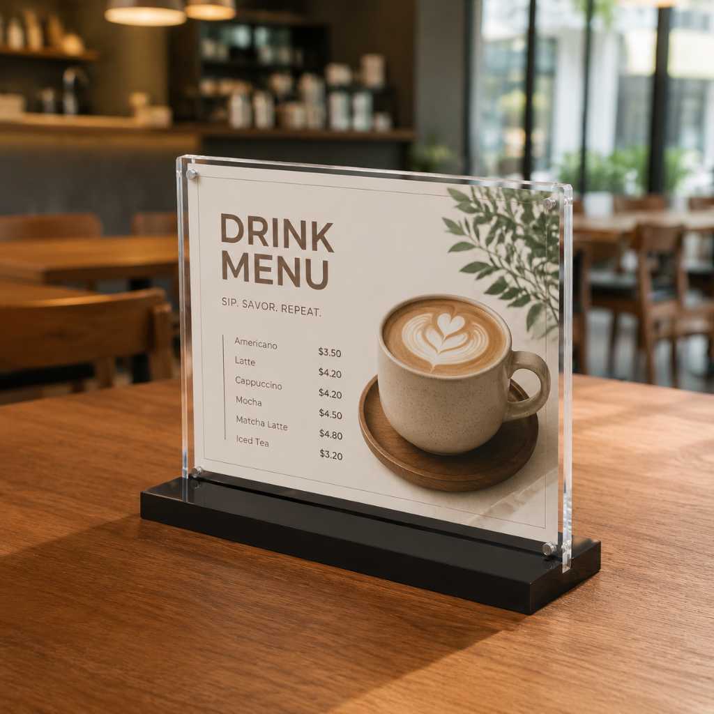
You walk into a store with a mental list, yet research from POPAI shows that over 70% of purchase decisions happen at the point of sale. Vistar Media’s findings push that number even higher, showing more than 80% of choices occur in-store. Between 84% and 86% of shoppers admit to impulse buys. These facts reveal a key truth: your in-store signage acts as a silent salesperson.
Good in-store signage shapes customer behavior at the moment of choice. Smart placement, clear messages, and proper lighting turn ordinary displays into tools that boost sales. This guide covers best practices that improve the shopping experience, helping you grab attention and drive sales when shoppers stand before your products.
Key Takeaways
- Put signs where people can see them easily, about 4 to 5 feet off the ground, in busy spots like store entrances and checkout lines.
- Use short, benefit-focused messages with high-contrast colors so shoppers get offers in three seconds.
- Show the original price crossed out next to the sale price. This can boost the urge to buy by up to 30%.
- Use clear deadlines and messages about limited stock to make people decide quickly.
- Use strong materials and change your signs often to keep your store looking professional and consistent.
Maximize Impact With Strategic In-Store Signage
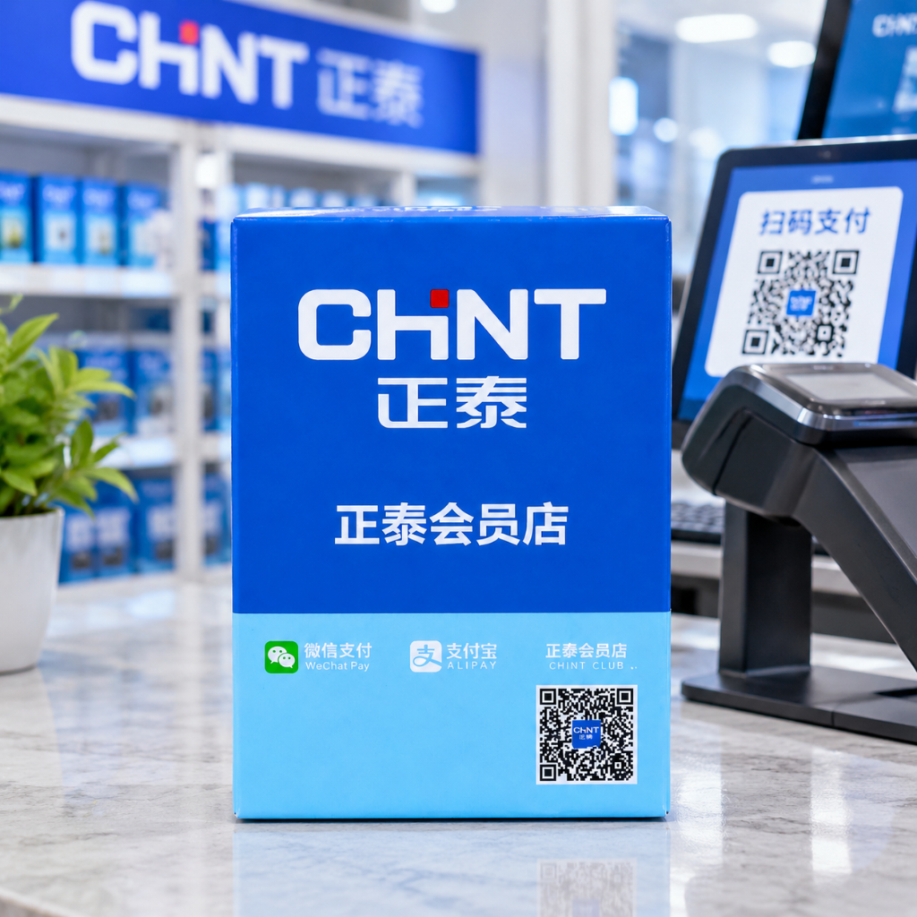
Putting signs in the right spots is the base of any good signage plan. Even great design won’t help if shoppers never see your message. Think about where customers naturally walk and where they stop. Store entrances, aisle endcaps, and checkout lines get the most foot traffic. These busy areas are the best places for your most important promotions.
Prioritize High-Traffic Zones and Eye-Level Placement
Place signs near the products they talk about, not just anywhere visible. Entrance signs set the mood before shoppers start looking around. Promotional signs at aisle ends catch attention where traffic slows down. Checkout displays are the last chance to make a sale, so they work well for impulse items like snacks or personal care products.
Where a sign sits up and down matters just as much as where it sits left and right. Industry rules put the best “strike zone” between 1.2 and 1.5 meters from the floor. This range matches what retail experts call the buy level. The Nielsen Company says eye level in stores is a bit lower than your real eye height because people grab items from waist level. The best shelf spot is between waist level and eye level.
Keep popular items and retail sign holders at this 1.2-1.5 meter range. All adults shop at this height, making it the most valuable space in your store.
A retail store in Indiana moved its storefront signs higher with bright graphics. This simple change brought a 30% rise in foot traffic within weeks, showing that visibility leads to more engagement.
Ensure Visibility With Proper Lighting and Sizing
Well-lit signs get noticed even in dark corners of your store. Bad lighting can ruin even the best sign placement. Check each spot and add extra lights where shadows cover your message.
Font size and sign size depend on how far away people will be. A customer three feet away needs smaller text than someone reading from across an aisle. Pick lettering that stays readable from the farthest spot someone might view it. Digital signs grab 400% more attention than static ones, so think about using electronic options for your most important messages. With over 70% of purchase decisions made inside the store, every part of your signage plan deserves careful thought.
Design Signage to Enhance the Shopping Experience
Your signage content decides if shoppers stop or keep walking. Good in-store signs talk directly to what customers need without taking extra time. The best messages take three seconds or less to understand. You want shoppers to get your offer right away, then pick up the product.
Craft Clear and Concise Messaging
Short, benefit-focused words beat clever wording every time. Phrases like “Buy One, Get One Free” or “New Arrivals” work because they show value clearly. Your customers should never wonder what you mean. Write at a reading level that fits your widest audience. Use action words and specific nouns. Skip adjectives that add nothing.
The rule of clarity and readability guides every word choice. Big, easy-to-read sans-serif fonts help customers find information fast. High-contrast colors, like black on white, cut down on frustration. Plenty of whitespace stops visual clutter. When you highlight discount percentages or product details with bold text, you point attention where it counts most.
Think about what makes people act. Top performers for response rates include BOGO offers, flash sales, and VIP early access. These formats mix urgency with clear customer value. A targeted message to 200 lapsed customers beats a blanket discount sent to 2,000 mixed contacts. Personalization drives results because it speaks to specific needs.
Targeted, benefit-driven promotions can produce measurable revenue spikes when applied to the right customer segments, as demonstrated by various retail case studies.
Your in-store signage should follow this same idea. Lead with the benefit, not the feature. Say “Save 20% Today” rather than “Storewide Discount Event.” Say “Fresh Baked Daily” rather than “Bakery Department.” Every word should earn its place on the sign.
Use Color and Contrast to Guide the Eye
Color shapes emotion before customers read a single word. Red creates a sense of urgency, making it perfect for driving impulse buys. Studies show red raises heart rate and reads as urgent, which is why it appears on clearance signage and anything meant to prompt an immediate decision. Blue conveys trust and reliability, making it suitable for informational signs. Yellow grabs attention from a distance, while green suggests freshness or eco-friendliness.
Contrast decides if your message stays readable under store lighting. Rules for accessible signage require that characters contrast with their background using either light characters on a dark background or dark characters on a light background. Accessibility standards require sufficient contrast between characters and background to ensure readability, with guidelines recommending a high contrast ratio for small text and a lower ratio for large text.
Best color combos include black and white for text-heavy signs, yellow and black for warnings, and blue and white for directional signage. Avoid red and green as the only distinguishing colors, since color blindness affects many shoppers. Test your designs with a color blindness simulator to ensure everyone can read them.
Compelling visuals work alongside color to capture attention. High-resolution product images and universal icons, such as arrows or sale tags, reinforce your message. Original designs with unique materials create immediate visual impact that reflects brand personality. Consider 3D effects or layered textures for premium displays.
Branding elements tie your signage together. Display logos consistently, use brand color schemes, and include taglines across all displays. This creates a cohesive shopping environment that strengthens brand recognition and loyalty. Customizable POP display systems can be tailored to align with your brand guidelines, ensuring every price strip and sign holder reinforces your identity.
When you combine clear messaging with strategic color and contrast, you lift the entire shopping experience. Customers move through your store with confidence, finding what they need without confusion. They linger longer at displays that speak clearly. They remember brands that present themselves consistently. Your signage becomes more than decoration; it becomes a guide that shapes every purchase decision.
Optimize Pricing and Promotional Displays
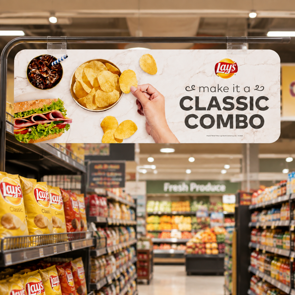
Pricing displays do more than show a cost. They shape how shoppers see value and whether they buy. When you show prices clearly and present them well, you guide customers without pressure. The right display turns a simple price tag into a strong sales tool.
Frame Value to Drive Conversions
Your pricing plan starts with how you show numbers. The anchoring effect strongly shapes how customers see value. When shoppers see a higher original price first, they use it as a mental starting point. The discounted price then looks better by comparison, no matter what competitors charge. This works even when customers know little about normal market prices.
The crossed-out original price stays one of the best retail tools. Controlled studies show that showing a reference price with a strikethrough next to the sale price boosts purchase intent by 20-30% versus showing only the sale price. This simple visual cue creates a sense of value that clearly drives buying choices.
When buyers see an original price crossed out and a discounted price highlighted to show savings, they feel they are getting a bargain. The original price sets a perceived value, making the discounted price feel like a win. This effect grows when the strikethrough shows a big discount, as buyers see the offer as especially valuable, creating urgency and pushing the purchase decision.
The anchoring effect does not work the same for all shoppers. Research shows that female consumers react more strongly to anchoring than male consumers. Shoppers in a good mood also show more openness to price anchors. Personal traits further shape how each person reacts to comparative pricing. You cannot control these factors, but you can design displays that boost the anchor’s effect for most shoppers.
Use words like “Only” or “Save” to frame value beyond the numbers. These terms shift focus from what customers spend to what they gain. “Only $19.99” sounds easier to afford than “$19.99.” “Save $10” highlights the benefit rather than the cost. Pair these phrases with accurate, easy-to-read price tags to build trust while driving sales.
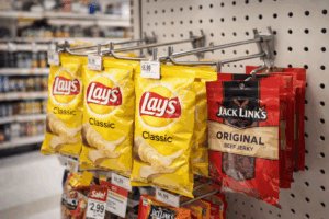
POP display systems offer practical ways to keep your pricing displays neat and professional. Shelf edge price strips attach directly to your shelving, letting you label multiple SKUs with precision and clarity. Reflex sign holders flex to fit most retail rails, adapting to various display setups. These products use durable plastics, so they handle daily use and cleaning without losing their clean look. Their ease of use means you can update prices quickly, keeping a polished appearance that supports your brand.
Create Urgency With Strategic Calls to Action
Once you frame the value, you need to prompt action. Time-limited offers in your in-store signage boost impulse buying by creating urgency. Messages like “Today Only” or “Limited-Time Only” shift the customer’s focus from need to chance. Waiting suddenly feels risky, as though delaying means missing out.
Scarcity tactics work best when they reflect real conditions. Invesp research confirms that time-limited promotions convert faster than regular deals. CXL A/B tests show that clear deadlines beat vague “limited-time offers.” A specific countdown like “Ends in 02:15:30” drives more action than a general statement. Baymard Institute research adds that clear stock information, such as “Only 5 left,” lowers uncertainty and speeds up buying choices.
The fear of missing out drives real behavior. Eventbrite statistics reveal that 69% of millennials have joined an event because they worried about missing it. Booking.com applies this idea at checkout by showing messages like “Only 1 room left” and “5 people are viewing this room.” This approach creates urgency that pushes immediate action.
Visual elements strengthen your calls to action. Bold colors like red and orange signal urgency naturally. Countdown timers add a clear deadline that customers can see. Rotate featured items often to keep excitement and stop displays from going stale. Each new promotion should feel fresh, prompting customers to make unplanned buys they might otherwise skip.
Your calls to action should also highlight key details that matter most to shoppers. Whether you stress a discount percentage, a low stock level, or an expiration date, make that detail impossible to miss. Clear, direct language paired with smart visual cues guides customers toward the choice you want. This approach improves the overall shopping experience by cutting friction and helping customers feel sure about their choices.
When you combine effective value framing with real urgency, your promotional displays work harder. Customers understand the offer quickly, see real value, and feel motivated to act now rather than later. Your pricing displays become active players in the sale, not passive labels waiting for attention.
Ensure Durability and Maintain a Fresh Look
Your signage investment only pays off when signs stay readable and attractive over time. The retail environment is tough on displays. Customers touch them. Carts bump into them. Cleaning crews wipe them down. Choosing materials that survive this treatment keeps your store looking professional.
Select Materials That Withstand the Retail Environment
Material quality determines how long your signs last. Cheap plastics fade, crack, or warp within weeks. High-grade materials resist these problems. POP display systems are built using durable plastics that withstand daily use and repeated cleaning without losing shape or color.
Structural brittleness signals replacement time. When plastic becomes glassy and may shatter instead of flex, it no longer protects your message. Color shifts also matter. If your sign’s color moves outside your acceptable brand delta, it creates visual friction that undermines your identity. Choose materials that resist UV damage and physical stress from the start. This choice saves you money because you replace fewer signs.
Implement a Routine for Cleaning and Updating
Even the best materials need regular care. Dust and fingerprints build up throughout the day. A monthly cleaning schedule keeps them looking fresh. Use a microfiber cloth and mild detergent. Avoid harsh chemicals that could damage the finish. This simple routine preserves the shopping experience you work hard to create.
Timely replacement matters just as much. Replace signage when structural brittleness appears. Replace it when color shifts move outside your brand standard. Replace it when your corporate brand guidelines evolve, even if the sign is physically perfect. Outdated branding confuses customers and makes your store look neglected. Old or damaged signs send a message that you do not care about details. That impression hurts trust and reduces sales.
Establish a regular inspection schedule. Walk your aisles weekly. Look for fading, cracking, or peeling edges. Remove damaged signs immediately. Order replacements before old signs become an eyesore. This proactive approach maintains a professional image and keeps your messaging consistent.
Scale Your Signage Strategy for Multi-Location Success
Growing from one store to many brings a new challenge. Each location needs the same brand feel without losing local appeal. Customers should recognize your store instantly, whether they walk into your original shop or a new branch across the state. McDonald’s shows this power with its golden arches and familiar interior design. That consistency builds loyalty because customers know they can repeat an enjoyable experience anywhere. When stores stray from expected branding, customers may switch to more predictable competitors.
Develop a Centralized Brand Kit and Guidelines
A centralized brand kit protects your visual identity across every location. This kit includes logo usage rules, color palettes, typography standards, and sign templates. Your branding elements stay consistent when every store pulls from the same approved source. Customers see the same colors and fonts repeatedly, which strengthens brand recall with each visit.
Start by creating an approved vendor network. These vendors sign contracts binding them to your brand standards. Then build a company store, a private portal that restricts choices to pre-approved items only. This governance tool prevents off-brand purchases before they happen. Inventory control ensures compliant materials stay in stock, so local teams never substitute alternatives when supplies run low.
Template systems with locked and unlocked zones work well for local promotions. Corporate controls lock brand elements like colors, fonts, and logos. Locations populate local content such as event names, dates, and addresses within designated areas. This approach maintains consistency while allowing local relevance.
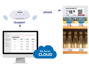
Centralized platforms let you push instant updates to any display at any location with a few clicks. Managing 1,200 stores becomes as manageable as managing 12. Bespoke manufacturing services can create custom solutions that fit specific store layouts, ensuring your signage works within each unique space.
Leverage Data and Feedback for Continuous Improvement
Your signage strategy should evolve based on real performance data. Track sales increases during signage campaigns, especially for point-of-purchase displays. Monitor customer traffic patterns and dwell time in areas where signs appear. This data reveals which messages actually drive purchases.
A/B testing provides clear answers about what works. Run tests comparing different messaging or design variations for the same product. Measure which version drives higher sales. Track dwell time and conversion rates for each option. The version that performs better gets rolled out store-wide.
One practical approach follows three steps. First, test creatives by comparing static versus animated promotions for the same product. Second, measure the sales lift each version produces. Third, reinvest screen time into the winning campaign to maximize impact.
Customer feedback also guides improvements. Walk your aisles and ask shoppers what they notice. Listen for confusion about pricing or wayfinding. This direct input complements your sales data and reveals gaps numbers cannot show.
This data-driven approach transforms your signage from guesswork into strategy. Each refinement improves the shopping experience for your customers. Your signs become sharper tools that consistently drive revenue across every location you operate.
Effective in-store signage shapes customer behavior at the critical moment of purchase. Research from POPAI shows that over 70% of buying decisions happen inside the store, and between 84% and 86% of shoppers make impulse purchases. Strong visual merchandising can significantly boost sales.
Your strategy rests on five pillars: strategic placement, clear design, optimized pricing displays, durable materials, and a scalable plan. Each element enhances the shopping experience and drives revenue.
Audit your current signage against these practices. Contact a signage provider for a consultation on how POP display systems can elevate your retail environment and improve the shopping experience.
FAQ
What is the best height for placing in-store signs
Place signs between 1.2 and 1.5 meters from the floor. This range matches the buy level where most shoppers naturally look and reach. It works for all adults, making it the most valuable space in your store.
How do I choose the right font size for my signs
Your viewing distance determines the font size. A customer three feet away needs smaller text than someone reading across an aisle. Pick lettering that stays readable from the farthest spot someone might view it.
How often should I update my in-store signage
Walk your aisles weekly. Look for fading, cracking, or peeling edges. Remove damaged signs immediately. Replace them when colors shift outside your brand standard. A monthly cleaning keeps them looking fresh.
How can I measure if my signage is effective
Track sales increases during signage campaigns. Monitor customer traffic patterns and dwell time near displays. A/B test different messages for the same product. Measure which version drives higher sales and roll out the winner.