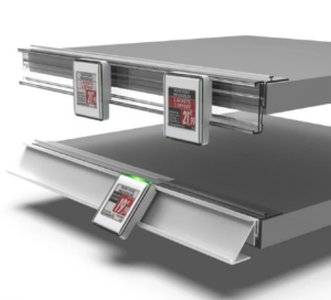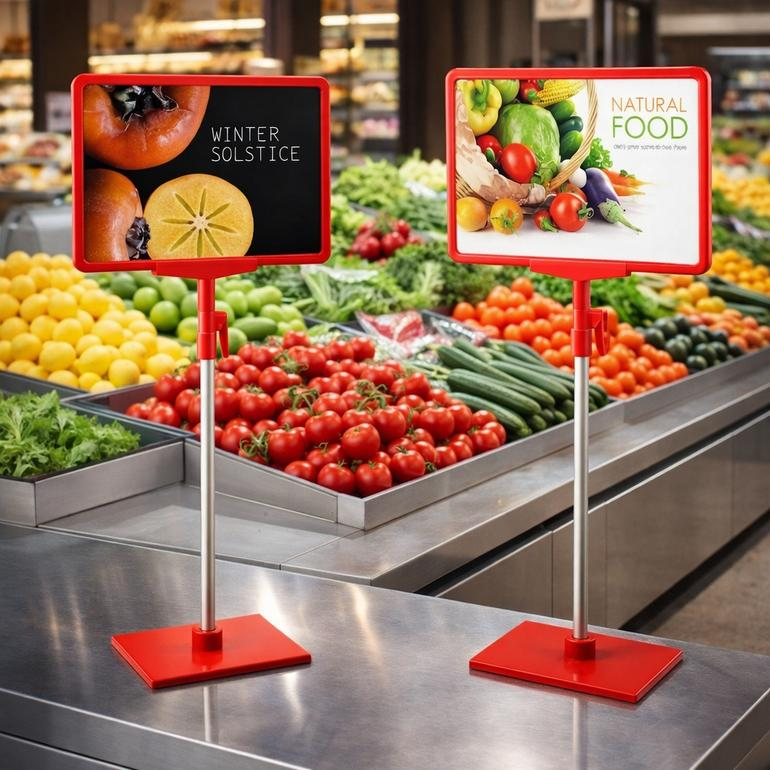
Many indoor showcard stands are not seen even when they are in plain sight. But you can make them more visible. Four main factors—placement, size, color, and lighting—decide how visible a sign is. Small changes in the sign’s height or angle can greatly improve how often people notice your signs. This insight from Google shows that you can get the most visibility and boost your brand with simple, cheap changes. The placement of your sign matters a lot. Sign design also has a big effect on attention. You can test different heights and angles easily. Nova-day’s lightweight PVC Foam Board POP Displays make it easy to follow these visibility tips. You can move them without much effort. This guide gives useful strategies backed by research to improve your effective signage.
Key Takeaways
- Place your sign at eye level (50-65 inches) in high-traffic areas to boost visibility by 60%.
- Angle your display 45 degrees to catch attention from multiple directions.
- Match letter height to viewing distance: 1 inch per 10 feet for readability.
- Use high-contrast colors like black on yellow to make your sign stand out.
- Test different placements and designs to find what works best for your store.
Indoor Showcard Stand Placement for Maximum Visibility

Where you put your indoor showcard stand decides if shoppers see your message or walk past it. The right spot puts your sign right in their way. The wrong spot hides it behind a pillar or a tall shelf. You need a clear plan for placement before you design anything else.
Position at Eye Level in High Traffic Zones
Eye-level placement works best. Studies show that signs placed in the golden zone between 50 and 65 inches from the floor catch 60 percent more eyes than signs placed lower. That same eye-level position leads to 30 percent more sales. Your customers naturally scan shelves at this height. They rarely look down at their feet or up at the ceiling.
High-traffic zones make this even better. Put your sign near entrances, checkout counters, or the ends of aisles. These spots see the most foot traffic all day. A sign at eye level in a busy aisle beats a beautiful sign hidden in a quiet corner. You want your promotional signage where people already look.
Nova-day’s lightweight PVC Foam Board POP Displays make this simple. You can lift and move them without tools or extra staff. Try different spots at different times. Move your sign until you find the best spot for your store. This flexibility means you can adjust quickly to changing traffic patterns.
Angle for Multi-Directional Visibility
A flat sign facing one way only reaches people walking straight toward it. Angling your sign opens up new sight lines. Turn your display at a 45-degree angle toward the main flow of foot traffic. This small change lets shoppers see your message from two different directions.
Multi-directional visibility matters in wide aisles and open spaces. People come from different angles. A straight-on sign forces them to change course. An angled sign catches their side vision naturally. This placement works especially well for trade show displays and seasonal promotions.
You can also tilt the sign slightly upward. This helps people see it from far away. The angle catches light better and cuts down glare. Test different angles during the day. Watch how shoppers react. Small changes in positioning create clear improvements in sign visibility.
Remember that placement is not a one-time choice. Your store changes weekly. New products arrive. Displays move. Check your sign placement often. This ongoing attention to placement helps with better lead generation and stronger engagement with your message.
Size and Scale to Improve Sign Visibility
Size decides if shoppers see your message from far away or only when they stand right in front of it. Many stores pick signs that look nice up close but vanish from a distance. You need to match your sign size to how far people will view it in your space. This simple step makes a big difference in how often people see your promotional message.
Match Dimensions to Viewing Distance
A clear rule guides sign sizing: use at least 2 inches of character height for every 100 feet of viewing distance. For closer viewing, use at least 1 inch of letter height for every 10 feet. This rule keeps your text readable from the farthest point where shoppers might see your sign. A sign with tiny letters forces customers to walk closer, and many will simply walk past instead.
Think about your store layout before ordering. Measure the longest sightline from your planned sign spot. A checkout counter sign might need only 2-inch letters. A sign at the back of a large retail floor might need 6-inch or larger characters. This planning prevents wasted money on signs that fail to share your message. The right size creates instant visual impact without crowding the space.
Your sign design should also consider how fast people walk by. Shoppers moving quickly need larger text to read your message in a glance. Slower-moving customers can handle smaller details. When unsure, choose larger characters. Oversized text rarely hurts readability, but undersized text always does.
Leverage Nova-day PVC Foam Board POP Displays for Flexibility
Nova-day offers custom sizes for their PVC Foam Board POP Displays. You can order exact dimensions that match your retail space and viewing distances. This flexibility means you do not settle for standard sizes that might not fit your needs. You get a sign built for your specific environment.
The lightweight nature of these displays makes size testing practical. You can order one size, test it, and easily swap it for a different dimension if needed. This adaptability works well for seasonal promotions or trade show displays where spaces change often. You can also request custom graphics that match your chosen dimensions, ensuring your branding looks professional at any scale.
Testing different sizes helps you find the best fit for your store. Start with the suggested character height for your longest viewing distance. Then try a larger version and compare results. The cost difference between sizes stays small, but the visibility difference can be large. Your signage investment pays off when you match size to your actual space.
Color Contrast for Better Sign Visibility
Color decides if shoppers see your indoor showcard stand or walk past it. Many signs fail because their colors blend into the store’s background. A white sign on a white wall disappears completely. A brown sign near wooden shelves becomes invisible. You must pick colors that stand apart from your surroundings. This choice directly affects your sign visibility and overall promotional success.
Choose High-Contrast Color Combinations
High-contrast color combinations make your showcard stand pop. Contrast means the difference between your background color and your text color. Greater difference creates stronger visual impact. Black text on a yellow background offers one of the strongest contrasts available. White text on dark blue also performs exceptionally well. These pairs grab attention from across the room.
Avoid colors that blend into your store’s environment. Look around your retail space before designing your sign. Notice wall colors, shelf colors, and floor tones. Choose sign colors that oppose those surroundings. A bright orange sign stands out in a neutral gray store. A deep red sign catches eyes in a white and beige space. This strategic color choice works for trade show displays too, where competing booths create visual noise.
Your brand colors matter, but visibility matters more. If your brand uses low-contrast colors, adjust them for signage purposes. Keep your logo recognizable while changing background or text shades. This balance preserves brand identity without sacrificing sign visibility. Test your color choices from a distance before committing to final production.
Ensure Readable Fonts and Sizes
Color contrast means nothing if shoppers cannot read your text. Font choice and size work together with color to create effective messaging. Choose bold, simple fonts for your main message. Avoid thin scripts or decorative typefaces that blur from a distance. Sans-serif fonts like Arial or Helvetica offer the best readability for retail signage.
Font size must match your viewing distance. Use the same sizing rule mentioned earlier: at least 1 inch of letter height for every 10 feet of viewing distance. A sign viewed from 20 feet away needs 2-inch letters minimum. This rule applies regardless of your color contrast. Even perfect high-contrast color combinations fail with text too small to read.
Your sign design should prioritize the most important words. Make your headline the largest element. Keep supporting details smaller but still readable. This hierarchy guides shoppers through your impactful message naturally. They read the main point first, then absorb supporting information if interested. This approach maximizes engagement with every person who passes your display.
Remember that contrast affects perceived size. High-contrast text appears larger and clearer than low-contrast text of the same dimensions. This perception works in your favor. Strong color choices make your signage seem bigger and more prominent. Combined with proper placement, this creates a display that demands attention and delivers your message effectively.
Lighting to Enhance Showcard Visibility
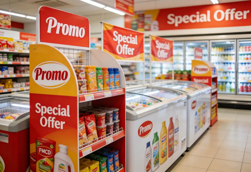
Lighting turns a plain sign into something people notice. Good lighting, like spotlights, backlighting, or LEDs, draws the eye to the most important parts of your display. Without enough light, even a great design gets lost in the background. You need a clear lighting plan that works with where you place your sign and the colors you pick.
Avoid Glare with Strategic Lighting
Glare makes your text hard to read and washes it out. When light hits your sign at a bad angle, it creates a bright reflection that hides your message. You can stop this problem by placing lights carefully. Put your light sources above and to the side of your sign. This setup cuts down on reflection bouncing back toward the viewer.
The kind of light you pick also matters for glare control. Hard light creates strong bright spots and dark shadows, which can look dramatic but may also cause glare. Bounce light gives a softer option. This method bounces light off white panels, creating a soft, spread-out source that reduces harsh shadows and lights the card surface evenly. For a sign near windows or overhead lights, bounce light helps you avoid unwanted reflections.
Check your lighting at different times of day. Natural light changes all the time. Morning sun might cause glare that goes away by afternoon. Walk around your sign and look at it from every side. If you see any reflection, move your light source or change the sign’s angle a little. This care keeps your message clear for every shopper who walks by.
Use Accent Lighting to Highlight Key Messages
Accent lighting points attention to certain parts of your sign. You can use this trick to highlight your headline, a special offer, or a product photo. Spotlights work great for this. A spotlight is a focused hard light that lets you control exactly where the light lands on your showcard. You can aim it right where you want people to look.
Broad light gives another choice for bigger displays. This semi-hard light has a wide beam that covers a large area evenly. It works well for larger stands that need steady light across the whole surface. For trade show displays, mixing spotlights with broad light adds depth and makes the display more interesting.
Your lighting should fit what your sign is trying to do. A seasonal sale might look good with dramatic spotlights that create strong highlights. A permanent information sign might need softer, even light for easy reading. Think about the feeling you want to create and pick your lighting to match. The right light makes your indoor showcard stand hard to miss, while bad lighting hides even the most carefully designed message.
Testing to Maximize Banner Visibility
You cannot guess what works best for your store. Testing gives you real answers about sign visibility. A/B testing compares two versions of the same display to see which one works better. This method removes guesswork from your choices. You learn what your customers notice and what they ignore.
A/B Test Placements and Designs
Start with placement. Pick two spots in your store that have similar foot traffic. Put your showcard stand in spot A for one week. Then move it to spot B for the next week. Count how many people stop at each spot. You might find that a spot near the entrance works better than one near the checkout. These placement tips come from real data, not guesses.
Test heights next. Your Nova-day display moves easily, so you can try different levels without extra work. Set your sign at 55 inches one week. Raise it to 65 inches the next week. Compare the results. You may find that a higher spot catches more eyes in your space.
Design testing also matters. Make two versions of your sign with different colors or headlines. Put them side by side in similar spots. Track which design gets more attention. Small changes in wording or contrast can make big differences in engagement. This works well for trade show displays, where you compete with many other booths.
Measure Performance with Simple Metrics
You need clear numbers to judge your results. Count how many people stop to look at your sign in a set time. Use a tally counter or a notebook. Track this number at the same time each day for consistent data. This tells you which placement and design combination draws the most interest.
Dwell time gives you another useful measure. Time how long shoppers pause near your display. Longer times mean your message holds attention. Shorter times mean people glance and move on. You can adjust your design to make people stop more once you see these patterns.
Sales lift gives the most direct measure of success. Compare sales of the promoted product during your test periods. A clear increase in sales shows your sign leads to purchases. This link between visibility and revenue proves the value of your display investment. These simple metrics help you improve your approach for better results over time.
Testing turns your displays into a learning tool. Each experiment teaches you something new about your customers. Use those lessons for every future sign you create.
Visibility comes from a system of four factors: placement, size, color, and lighting. Each factor works together to make your sign noticeable. Pick one factor, like lighting, and test it this week. Use your Nova-day PVC Foam Board POP Display for easy adjustments. These lightweight displays allow quick repositioning. Small changes to your sign produce measurable improvements. Your sign’s placement affects how many people see it. Better sign design also boosts customer engagement. Testing different sign positions helps you find the best spot for your promotional displays. This approach supports better lead generation for your business. Remember, even small adjustments yield measurable improvements in visibility. A clear call to action drives results. Start by repositioning your showcard stand today and watch your engagement increase.
FAQ
What height works best for my showcard stand?
Place your sign between 50 and 65 inches from the floor. This eye-level zone catches 60 percent more eyes than lower placements. Your sign performs best in busy aisles near entrances or checkout counters.
How do I pick the right size for my sign?
Use at least 1 inch of letter height for every 10 feet of viewing distance. Measure your longest sightline before ordering. Match your sign dimensions to your store layout for maximum readability.
What colors make my sign more visible?
Choose high-contrast pairs like black on yellow or white on dark blue. Avoid colors that blend into your walls or shelves. A clear sign stands out from any distance in your store.
How can I test my sign placement?
Compare two different spots for one week each. Count how many people stop at your sign. Track sales of the promoted product during each test. This data shows you the best location for your display.
Can I reuse these displays for different promotions?
Yes. Nova-day PVC Foam Board displays are lightweight and durable. You can change the graphics and reposition your sign for new campaigns. This flexibility saves money on future promotions.